
In the final part of this series, I will show you how to visually recognize and evaluate incoming invoices with high invoice amounts. For this matter, we will use simple Excel tools and illustrate the described approach with two graphs.
Part 4 of the series: “Very high incoming invoice amount”
1. Where Topmanagers should keep an eye on
2. Getting serious: What are high incoming invoices?
3. Analytics of high incoming invoices
4. Two graphics for evaluating high incoming invoices
Normal distribution with outliers?
In statistics, one would normally like to eliminate the statistical outlier to make diagrams look “pretty”, right? However, we want to identify this exact statistical outlier. For this purpose and as the first step, we want to visualize the distribution of our incoming invoices graphically and see whether a normal distribution can be found in our data. For this observation, we will simply use the Excel function for the log-normal distribution, which is built as follows:
=LOGNORM.DIST(x; mean; standard deviation; cumulative)
At this point, we choose the log-normal distribution, because the normal distribution has a range of values from -∞ (infinite) to +∞ (infinite). However, an incoming invoice should not have a negative value, which is why we will use the log-normal distribution that ranges from 0 to +∞ (infinite). Furthermore, invoice amounts are known to be frequently log-normal distributed.
We therefore pick a vendor from our data set and calculate the probability density function of the log-normal distribution based on the displayed function for every invoice amount. Should you have missed the part about the mean value and the standard deviation, I recommend you read Part III of this series first. At this point, we won’t reach our goal without the basics about the mean value and the standard deviation.
Let us take the respective invoice amounts and calculate the probability density of the log-normal distribution with the given formula. Afterwards, we select the amounts as well as the calculated log-normal distribution and insert a new point diagram through “Insert – Diagrams – Point(XY)”. Hence, outliers become quickly visible because they lay far away from the log-normal distribution. In the following example, I labelled the diagram and highlighted the outlier in red. For the available sample data, the output looks as follows:
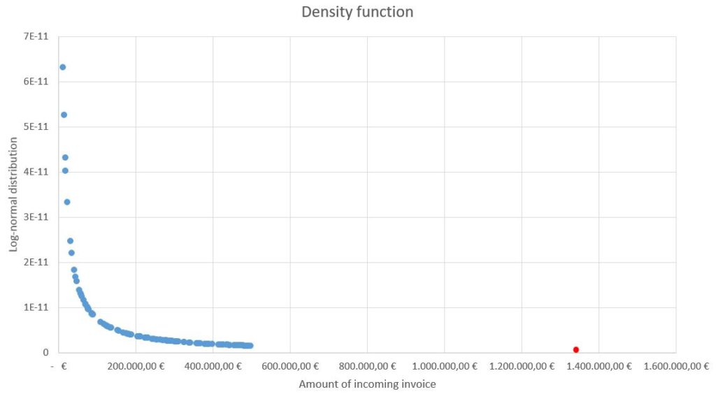
With this, we illustrated the log-normal distribution quite simply and can recognize immediately that the red dot is a statistical outlier.
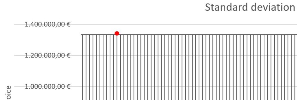
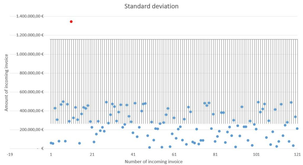
The sixfold standard deviation?
Of course, we also have the possibility to display the sixfold standard deviation in the diagram. By doing this, the outlier gets clearly visible in the diagram. For that, we click on the diagram and then on the small green plus symbol on the top right of the diagram. In the category “Error Bars”, we choose the small submenu “More options…”. In the new window, we simply choose the “Plus” direction, the end style “Cap” and a standard deviation(s) of “6”. By now, the sixfold standard deviation is delineated in the diagram as a grey grid. For the present case, I had to zoom into the graph to be able to identify the outlier as such (slightly over the sixfold standard deviation):
As you can see in the following picture, it looks a little more distinct with the 5-fold standard deviation:
The Excel file with the respective data is available to you for download, so you can follow all the steps. You can find the file here:

If you have questions concerning the represented graphs or if something seems unclear, please contact us here. Have you already conducted such analytics yourself or did you take another approach? Then please let us know.